





Website Design Mistakes That Are Killing Your Business Sales

Website Design Mistakes That Are Killing Your Business Sales
A beautiful website can still be a poor salesperson.
It may have modern colors, attractive animations, professional photographs and impressive graphics—but if visitors cannot quickly understand what you offer, trust your business or figure out what to do next, the website may quietly be costing you customers.
For most businesses, website design should not be judged only by appearance. It should support a clear journey:
Visit → Understand → Trust → Explore → Take Action
Businesses looking for Website Design Services in India should therefore focus on more than visual design. Good websites combine usability, speed, mobile experience, persuasive content, credibility and clear conversion paths.
Here are some of the most common website design mistakes that can reduce enquiries and sales—and how businesses can improve them.
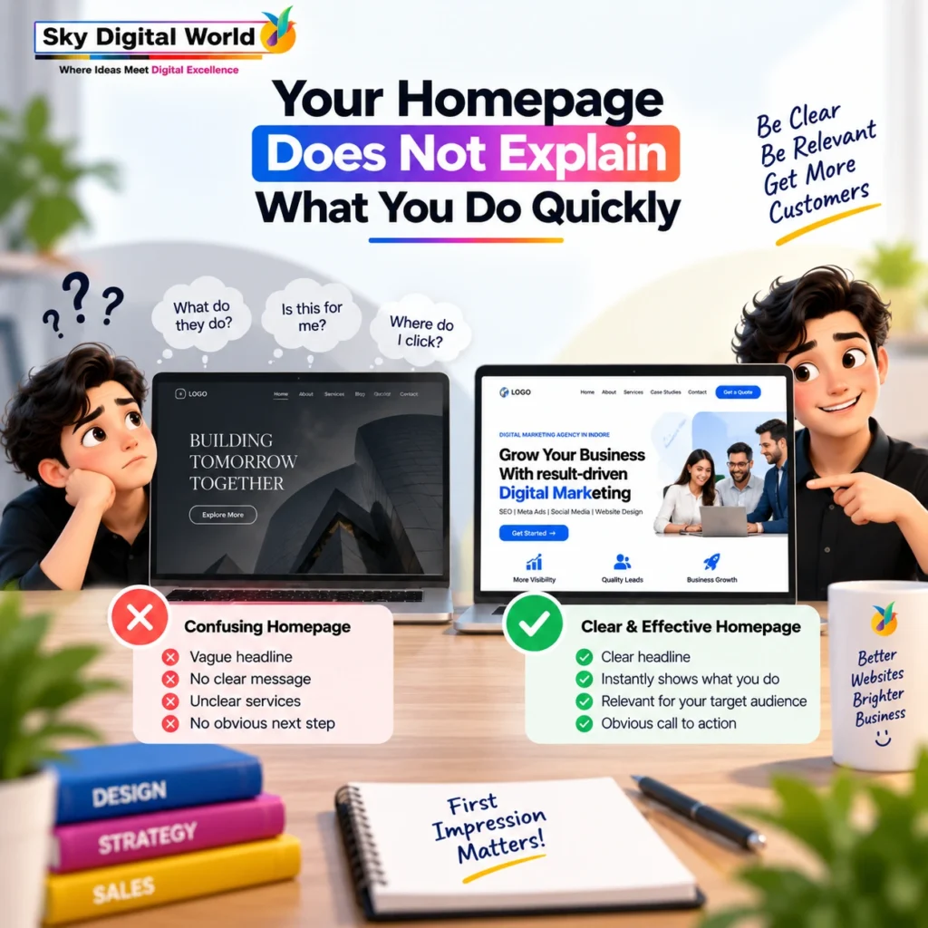
1. Your Homepage Does Not Explain What You Do Quickly
Open your website and look at the first screen without scrolling.
Can a new visitor understand:
What do you offer? Who is it for? Why should they care? What should they do next?
If not, the website may be creating unnecessary confusion.
Many businesses use vague headlines such as:
“Building Tomorrow, Today.”
It sounds impressive, but it does not explain the business.
A clearer headline might be:
Industrial Scaffolding & Steel Solutions for Construction Projects
Now the visitor immediately understands the category and relevance.
Creativity is useful, but clarity should come first.
Your homepage should not make visitors solve a puzzle before understanding your business.
2. Too Much Information Creates Decision Fatigue
Businesses often assume that adding more content makes a website more convincing.
It can have the opposite effect.
Ten banners, multiple pop-ups, several CTAs, long paragraphs, moving elements and dozens of service boxes can overwhelm visitors.
A good website uses visual hierarchy to tell users:
Look here first. Then understand this. Then take this action.
Whitespace is not wasted space. It gives important information room to breathe.
Instead of trying to communicate everything on the first screen, prioritize the most important message.
Simple does not mean empty. Simple means intentional.
3. Your Website Looks Good on Desktop but Fails on Mobile
A website cannot be considered well designed if its mobile experience is poor.
Common mobile problems include tiny text, buttons that are difficult to tap, oversized banners, horizontal scrolling, overlapping sections, intrusive pop-ups and forms that are painful to complete.
Google predominantly uses the mobile version of a site’s content for indexing and ranking, making mobile usability important for both visitors and search visibility.
More importantly, your potential customer should not need to zoom, rotate the phone or struggle through a broken menu just to contact you.
A responsive website should feel intentionally designed for mobile—not merely compressed from a desktop layout.
4. Slow Pages Are Creating Friction Before the Sale
Imagine clicking an advertisement and waiting several seconds for the landing page to become usable.
Some visitors will wait.
Others will leave.
Large uncompressed images, excessive scripts, heavy sliders, unnecessary plugins, poorly configured hosting and complex animations can all contribute to performance problems.
Google’s Core Web Vitals currently focus on loading performance, responsiveness and visual stability through LCP, INP and CLS. Google also recommends achieving good Core Web Vitals for success with Search and for a good user experience, while noting that good scores alone do not guarantee top rankings.
From a sales perspective, the principle is simpler:
Every unnecessary delay creates another opportunity for the visitor to leave.
Optimize performance because customers deserve a faster experience—not because you are chasing a perfect score.
5. Your CTA Is Either Missing or Everywhere
A visitor reads your service page.
What happens next?
If there is no obvious next action, you may lose someone who was interested.
But the opposite problem also exists.
Call Now. Get Quote. WhatsApp Us. Download. Subscribe. Book Meeting. Contact Us.
When everything demands attention, nothing feels important.
A better approach is to identify one primary conversion goal for each important page.
For example:
Service Page → Request a Consultation
Product Page → Buy Now / Request Pricing
Case Study → Discuss Your Project
Blog → Explore Relevant Service
Supporting CTAs can still exist, but the primary action should be visually obvious.
6. Your Website Talks About You More Than the Customer
“We are innovative.”
“We are passionate.”
“We provide world-class solutions.”
“We believe in excellence.”
Businesses naturally want to talk about themselves. Customers, however, usually arrive because they have a problem, requirement or goal.
Shift the conversation.
Instead of:
“We provide professional digital marketing solutions.”
Try:
“Reach more relevant customers through SEO, paid advertising and conversion-focused digital campaigns.”
The second version helps the visitor understand the outcome.
A strong website balances who you are with why that matters to the customer.
7. Weak Navigation Makes Visitors Work Too Hard
Your navigation should feel predictable.
Visitors should not have to guess where services, products, pricing information, contact details or company information are hidden.
Avoid unnecessarily clever menu labels.
“Solutions” may work when clearly structured.
“Explore Possibilities” probably does not tell someone where your services are.
For many business websites, straightforward navigation such as:
Home | About | Services | Industries | Work | Blog | Contact
is perfectly effective.
If you offer many services, organize them into logical groups rather than forcing everything into one giant menu.
A visitor who cannot find something cannot convert on it.
8. Your Service Pages Are Too Generic
One of the biggest missed opportunities in business website design is creating thin service pages.
A page containing a service name, stock photograph and two paragraphs rarely answers enough questions.
A useful service page can explain:
What the service is
Who it is suitable for
What problems it addresses
How your approach works
What is included
Why your company is credible
Frequently asked questions
What the visitor should do next
This also gives search engines more meaningful context about the page.
Professional Website Design Services in India should therefore consider content architecture and conversion strategy alongside visual appearance.
9. You Are Hiding the Proof
A business can say it is experienced.
Visitors are more likely to believe evidence.
Depending on your industry, useful trust signals may include genuine testimonials, case studies, project photographs, client names where permission exists, certifications, awards, years of experience, team credentials, manufacturing capabilities or measurable project outcomes.
But proof should be specific and authentic.
Instead of:
“Amazing company! Highly recommended.”
A detailed testimonial explaining the problem, experience and outcome is usually more informative.
Similarly, a case study showing the challenge, approach and result provides context that a generic claim cannot.
Trust grows when claims have evidence behind them.
10. Your Contact Form Feels Like an Application for a Bank Loan
A potential customer wants to ask about your service.
Then the form asks for:
Name.
Email.
Phone.
Company.
Designation.
Address.
City.
Industry.
Budget.
Team size.
Annual turnover.
Project details.
Some information may genuinely be required for complex B2B sales, but unnecessary fields add friction.
Ask yourself:
Do we need this information before the first conversation?
If not, consider removing it.
For a simple enquiry, name, phone/email, service requirement and a message may be sufficient.
For qualification-heavy services, a few additional questions can make sense.
The form should support your sales process without punishing the visitor for contacting you.
11. Your Website Has No Clear Trust Identity
Before contacting an unfamiliar company, customers may look for basic reassurance.
Who runs the business?
Where does it operate?
How can someone contact it?
Does the About page contain meaningful information?
Are important policies accessible?
Does the company appear consistent across its digital presence?
A professional website should make the business feel real.
Include accurate contact details, useful company information, relevant team or leadership details where appropriate, privacy information and authentic brand assets.
Avoid fake counters, invented reviews or exaggerated claims.
Trust is difficult to build and very easy to damage.
12. Poor Visual Consistency Makes the Brand Feel Unfinished
A red button on one page.
A purple button on another.
Five font styles.
Different icon styles.
Random stock photographs.
Headings with inconsistent spacing.
Each issue may appear small, but together they can make the website feel less polished.
Create a basic design system covering:
Typography → Colors → Buttons → Icons → Spacing → Forms → Image Style → Cards
Consistency makes navigation easier and strengthens brand recognition.
Visitors should feel they are moving through one connected brand experience.
13. You Designed the Website Without Considering Search
Website design and SEO should not be treated as completely separate projects.
A visually impressive website can still struggle if it has confusing page architecture, weak content, poor internal linking, inaccessible navigation or technical issues that affect crawling and indexing.
Google recommends creating helpful, reliable, people-first content rather than content primarily created to manipulate search rankings.
That principle fits good web design perfectly.
Build pages for customers first while ensuring search engines can understand and access them.
A website structure might include:
Homepage → Service Categories → Individual Services → Supporting Resources → Conversion Pages
This creates clearer journeys for both people and search systems.
14. Your Landing Page Does Not Match Your Advertisement
This is a particularly expensive mistake.
Imagine an advertisement saying:
“Website Design for Manufacturing Companies.”
The visitor clicks and lands on a generic digital marketing homepage containing SEO, social media, branding, video production and ten other services.
The connection is lost.
A better landing page continues the same conversation:
Ad: Website Design for Manufacturing Companies
↓
Landing Page: Manufacturing Website Design
↓
Content: Capabilities, product presentation, enquiry generation, project examples
↓
CTA: Discuss Your Website Requirement
This is known as message alignment.
The visitor should feel that the page was the natural destination for the advertisement they clicked.
15. You Measure Traffic but Ignore Conversions
Website analytics should answer more than:
“How many people visited?”
You also need to understand what visitors do.
Depending on your business, meaningful actions may include form submissions, phone clicks, WhatsApp clicks, quote requests, purchases, booked consultations or downloads.
Consider the difference:
Website A: 20,000 visitors → 30 qualified enquiries
Website B: 5,000 visitors → 120 qualified enquiries
Traffic alone would make Website A appear stronger.
Business results tell another story.
This is why conversion tracking should be planned as part of the website—not added as an afterthought.
What Should Website Design Services in India Include?
A professional website project should go beyond choosing colors and building pages.
Depending on the business, Website Design Services in India may include strategy and requirement discovery, information architecture, responsive UI/UX design, conversion-focused page structure, content planning, development, technical SEO foundations, performance optimization, analytics setup, form testing and post-launch quality checks.
The exact scope will vary.
What matters is that design decisions connect back to the customer’s journey and the business objective.
A website for a manufacturer generating distributor enquiries should not be structured like an e-commerce store.
A local clinic should not have the same conversion journey as a SaaS company.
Good design begins with understanding what the website needs to accomplish.

A Simple Website Sales Test
Open one of your most important pages and pretend you have never heard of the company.
Within a few moments, can you answer these five questions?
- What does this company offer?
- Is this relevant to me?
- Why should I trust them?
- Can I easily find the information I need?
- What should I do next?
If one or more answers are unclear, you have identified an opportunity to improve the website.
Do not redesign simply because the website looks old.
Redesign when you can make the experience clearer, faster, easier and more persuasive.
Final Thoughts
A website does not lose sales because it lacks enough animations, gradients or trendy effects.
It usually loses opportunities through friction.
Visitors become confused. Pages load slowly. Mobile layouts become difficult to use. Important information is buried. Trust is weak. Calls to action are unclear. Forms ask too much. Advertising and landing pages do not match.
Strong Website Design Services in India should solve these problems by combining visual design with user experience, content, performance, SEO and conversion thinking.
Your website does not need to impress every visitor.
It needs to help the right visitor understand your value, trust your business and confidently take the next step.
FAQs
Common problems include unclear messaging, slow pages, poor mobile usability, confusing navigation, weak calls to action, generic service content, limited trust signals and unnecessarily complicated enquiry forms.
Yes. Design influences how easily visitors can understand information, navigate pages, evaluate credibility and complete actions such as enquiries or purchases. Conversion performance also depends on factors such as the offer, audience quality, pricing and sales process.
Page experience and Core Web Vitals can contribute to search performance, although Google makes clear that good Core Web Vitals alone do not guarantee top rankings. Faster, responsive pages can also reduce unnecessary friction for visitors.
Depending on the project, services may include strategy, UI/UX design, responsive development, content structure, conversion planning, technical SEO foundations, speed optimization, analytics, forms and pre-launch testing.
Consider a redesign when the current site no longer represents the brand, performs poorly on mobile, is difficult to navigate, loads slowly, cannot support current marketing goals or consistently fails to turn relevant visitors into meaningful actions.